Cover Stories: Black Sabbath’s ‘Sabbath Bloody Sabbath’
What if we told you that Black Sabbath, Indiana Jones, and the Muppets have something in common? You'd probably think we'd be coughing up "Sweet Leaf" for too long, but it's true.
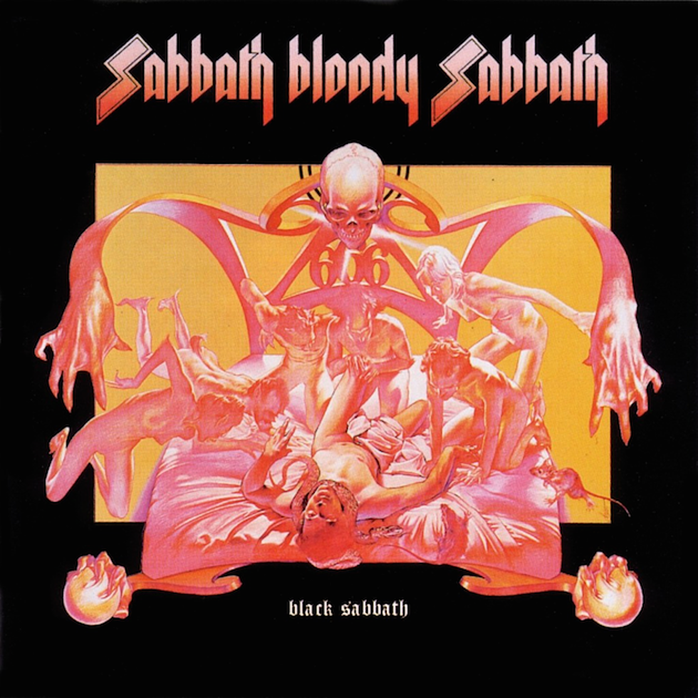
Sabbath's fifth album, Sabbath Bloody Sabbath, features one of history's most iconic covers, a two-sided affair depicting a similar scene from two different perspectives. The book Heavy Metal Thunder claims that the painting's name is "The Rape of Christ," and quotes a January 1974 interview with Ozzy Osbourne regarding its meaning:
The front of the cover represents a man dying on his deathbed. There are all these distorted figures bending over him and gloating as he lies there. These figures are actually him at different stages of his life. He's a man of greed, a man who's wanted everything all his life and done all this evil stuff. But flip the album over, and the back represents the good side of life. The person on the bed has been really good to people. He's got all these beautiful people crying over him as he's dying. At the bottom of the bed, he has two tame lions guarding him. All in all, this represents the good and bad of everything.
Decades later Osbourne wrote in his memoir, I Am Ozzy, that Sabbath Bloody Sabbath was "our last truly great album, I think. Even the artwork was spot on.... I f----ing love that cover." Regarding the back cover, Martin Popoff quotes drummer Bill Ward in his book Fade to Black:
On just a personal note, I love the back of that album cover, really nice. I guess if I ever wanted to die, in a certain way, that's how it would be, with all of the animals and everything, everybody just around me, or whatever. It was interesting to see what it did to people.
The sleeve was the work of artist Drew Struzan, a young man on the brink of a legendary career. Struzan was working at Pacific Eye & Ear, a design firm owned by creative director Ernie Cefalu. Within a decade, Struzan's artwork would be among the most iconic in movie history. Raiders of the Lost Ark's poster? Struzan. Back to the Future? Struzan. The Star Wars prequels and the Harry Potter movies? Struzan, Struzan, Struzan. And let's not forget the Muppet Movie which, as we promised, connects Sabbath to Kermit. Altogether, the man is responsible for at least 150 movie posters and over 30 album covers.
The artist is still working and still at the top of his game. His advance posters for Star Wars: The Force Awakens have received tremendous praise, with some fans claiming they are his finest work ever. Call us sentimental, but Sabbath Bloody Sabbath will always remain at the top of our list, but we kept that to ourselves when we talked to Struzan recently.
Ernie Cefalu says: "My concept for this album was based on two color illustrations that were given to me on my confirmation day in 1955," but the finished work is distinctly yours. Aside from using Cefalu's references as a starting point, was there much collaboration here?
Who can say who came up with the idea first? Science has proven how unreliable our memories are. This is what I remember about the job: I was told that Black Sabbath wanted an album cover of a man dying and I stretched it out. My first question was, “Can we do a front cover and a back cover?”
I didn’t want to do just a guy dying. I could have had a shooting or a poisoning but that wasn’t appealing to me. I look at life in a positive way, even in death. If you’re a good man with a good heart and at peace with who you are, death is not a horrible thing. A man who has practiced badness and has a bad conscience with regrets and sorrows and fears, his death will be a scary thing. Our culture sees death as some kind of judgment and now you face what you were. One guy faces judgment while another faces blessings if that’s the way you want to look at it. We had a front and back cover. I wanted to show the comparison. I thought it was a truth.
The symbolism was all mine. I was studying symbolism and intrigued by the power and meaning it holds for people. It was fun to put symbolism into paintings. I was reading the Book of Revelation. It portrays God as having four main personality traits so I used that symbolism for the good man’s death. There’s a man with his arms outstretched hovering over the good man. He represents love since mankind is supposed to be like his maker in that regard. Love should be an exceeding personality trait. Then there is the bull that symbolizes power. The eagle represents God’s high-flying wisdom, farsightedness. And then there’s the lion that represents courageous justice. Justice gives us peace. If we have done right, we have nothing to fear from God.
That was my spiritual understanding at the time. I was looking at the light side and the dark side, the truth of things. Death brings to the forefront the big picture of our humanity. The band wanted a picture of a man dying. I didn’t want to be limited to that image. We have freedom of choice. We can choose who we are. There is no destiny. We can choose to be good or bad, loving or not.
I think that what I showed with these pictures was not just to show death but to reach out to people and say ‘notice that the guy dying is the same in both pictures and notice that the loving people around him are the same people around him in a bad death?’ That brings to the fore making a choice. By giving love, we become life-giving rather than death-dealing. All this factors into these two pictures and why this still resonates with people after all these years. Blue is peaceful; red is violent. It’s all there. It resonates with people.
The band still writes every now and then to thank me for these paintings.
The original artwork is huge by album cover standards -- 30"x40." Why work so big when the final is going to be 12"x12"?
Because I could. There’s a lot of stuff in those paintings and scale gives you room for detail.
We think of the album era (particularly the '70s) as kind of a golden age for album cover artists. Can you elaborate a bit on what it was like being an album cover artist during that heyday?
That’s looking back. When you are living life, it’s not a heyday. It’s just life. I got those jobs because the industry was open to new expressions. I got work in the industry and before I worked at Pacific Eye & Ear because the industry was open. That’s what made it a heyday. Now they are just repetitive because they focus on making money. In those days they thought of creativity and newness.
It was the '60s and the '70s. Freedom. We thought we were changing the world and music was a big part of the movement. The music was new. All that beautiful stuff was new. It is far too monetarily motivated today.
It was fun. Historically, it was a bigger canvas. You could work front and back and the albums were 12 inches square. CDs came along and they were five inches. That goes along with the question of why I worked so big. What would be the point now? There’s nothing you can do in five inches so it just became little ditties for covers.
Did you work with Black Sabbath during the project? You mentioned that they've been in touch in the years since, but at the time did they offer any input or feedback on the sleeve?
I never met the band. I worked in the studio. When the bands came in, they went into the president’s office and they had a party. If I met the band, let me apologize for not remembering because it was a long time ago.
What kind of response did you receive on the album cover? Particularly in the '70s, people tended to be a little screwy about anything construed as Satanic.
The only people who thought it was Satanic were the little old religious ladies. I was a working stiff and all I prayed for was that I would get a check at the end of the week. At the time, If people brought in positive comments it went to the business. It didn’t go to me. That’s the way it works.
The response to the cover, speaking historically, is more after the fact and way down the line. The work still has a life, it’s still breathing, people are still interested and still excited about it. I did my job. It touched people’s hearts and minds and consciences. It’s probably bigger now than it has ever been as far as being successful for the artwork’s sake.
You came of age during a period when representational art was frowned upon in fine arts circles. Was there a push-pull there, or like, say, Robert Williams for example, were you always clear that you wanted to paint things that look like things (to paraphrase Williams)?
When I went to school the byline was, “Art is dead; everything’s been done.” And it was killed because it did become non-representational and, more than that, it was silly. It became silly art.
I didn’t feel that way about art. I thought it was the greatest form of communication that cleanly and straightforwardly speaks to other people. It speaks to their souls and their loves and their concerns. It speaks to beauty and truth and I didn’t want to think of art as being dead, something that was made of trash.
If this is my gift to the world then I want it to be a gift of truth and beauty. I was painting people. Let’s go back to the four qualities of God: love, wisdom, power, justice. I still think it works and apparently it does because here we are 40 years later still talking about the art. And those things are the profane piece, too. It’s powerful and true.
You're best known for your movie posters, but you created quite a few album covers. Any favorites?
No favorites. I can think of wonderful experiences and musicians and artists that I got to meet. I got to do what I wanted, which was to paint, and meet such lovely people.
Mary Travers [Peter, Paul & Mary] did a solo album. When I painted the cover for the album her only request was not to paint her portrait as it had been painted so poorly in the past. I painted it anyway and she loved it so much she flew out to L.A. and brought me two dozen yellow roses. Subsequently, I would send her yellow roses whenever they were in town performing.
Modern Jazz Quartet was the same way. They posed for me so that I could paint them. They had a good time.
Alice Cooper used to come in and sit next to me while I was painting his portrait. He was fascinated by the work. He said he had more fun watching me paint the album cover than he had making the album. [Struzan painted the sleeves for Welcome to my Nightmare and 1974's Alice Cooper's Greatest Hits.]
I got to paint beauty for people and it made them happy. That’s my favorite thing.
Sabbath Bloody Sabbath Back Cover:

You Think You Know Black Sabbath?
See Where Black Sabbath's Tony Iommi Ranks Among Our Top 50 Hard Rock + Metal Guitarists
More From Loudwire


