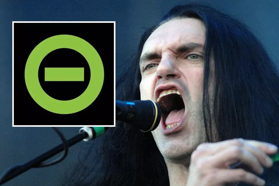
Why Type O Negative Always Used Neon Green in Their Logos + Imagery
It turns out there was a good reason why Type O Negative kept using bright green for their band logos and it wasn't just because they liked the color either.
Type O Negative guitarist Kenny Hickey, who recently released a new album with Silvertomb, broke down the band's name, logo and color scheme during an episode of the HardLore podcast.
Peter Steele Wanted The Band to Stand Out
During the episode, Hickey explained why Type O Negative vocalist/bassist Peter Steele insisted his band stand out and be different from others in a busy New York rock and metal scene.

"He (Peter Steele) hated the whole generation where guys went on stage wearing other rock band shirts," Hickey said. "He couldn't stand it. He said, 'That's bullshit. You're a musician. You should have an image. There should be something identifying you and separating you."
In Hickey's opinion, much of it stemmed from Steele's disdain for other bands he saw as "competition." That is what made Steele want to develop a unique identity for his own band.
"Always with him, if he was going to form a band, we had to find a name first, obviously, and you had to have a symbol directly attached to the band so you're identified immediately and you had to have a color bar."
The Reason Type O Negative Used Green
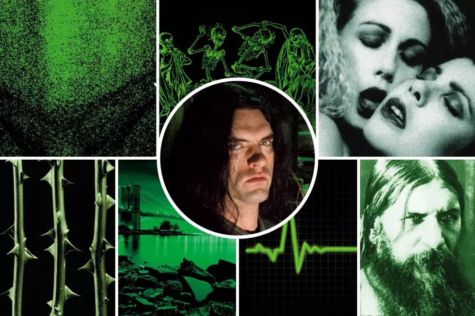
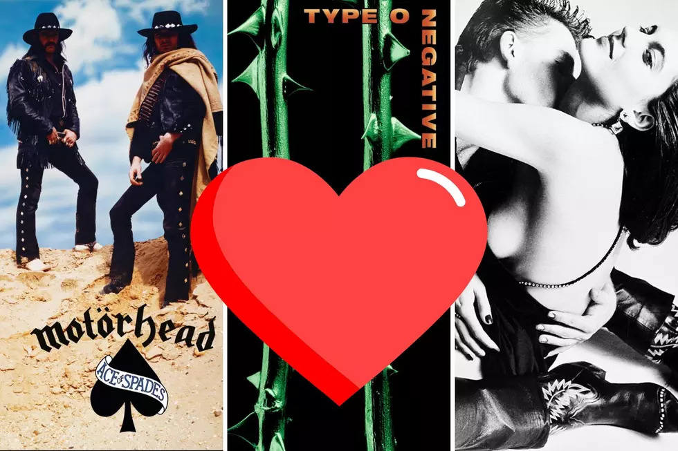
Among Type O Negative's unique characteristics was the band's use of bright green. The color was part of the band's logo and also dominated the artwork for the first album Slow Deep and Hard and largely set the tone for the rest of the catalog (The Origin of Feces 1994 reissue swapped Steele's hairy hind quarters for a bright green version of the late 1400s Dance of Death painting).
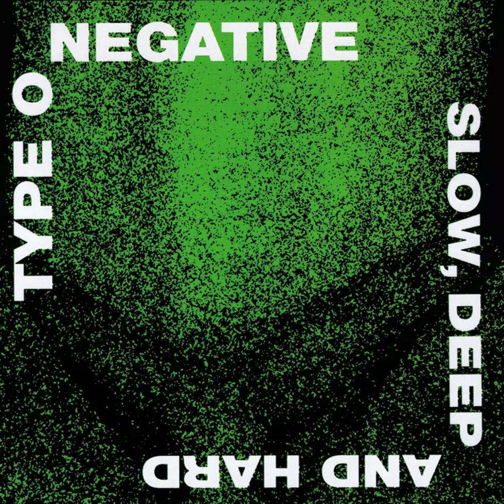
Hickey credited Steele as the one who suggested using the almost neon shade of green everywhere. But he also was quick to say it wasn't because his late bandmate thought it was appealing.
"He felt green was the most repulsive color."
The use of the bright green color went beyond what fans saw on album artwork and Type O Negative T-shirts. It also found its way into a practice space that Hickey, a former union carpenter, built in drummer Sal Abruscato's basement.
READ MORE: The Rise in Value of Peter Steele's 'Playgirl' Issue on eBay
Steele decided to handle painting the room with paint he took from his day job with the New York City parks department. Unfortunately, Hickey said Steele's paint job didn't necessarily stick.
"I remember Peter's contribution was he took some really cheap, like olive puke green paint from the parks department. It was so humid down there and he painted the walls green and it never dried. A year later, you would back up into the wall and you had green on you."
Type O Negative's Band Symbol Came Before Their Name
You'd think it would help for a band to have its name firmly in place before coming up with its official symbol or logo, but that wasn't the case for Type O Negative. The band settled on its iconic logo of an O with a negative sign in the middle well before they became Type O Negative.
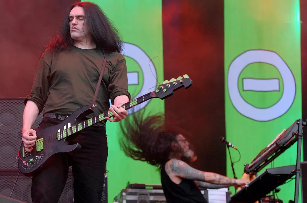
Hickey said the logo initially came from a "Sunday hardcore day" Peter Steele started at Brooklyn metal club L'amour. The venue was often called "the Rock Capital of Brooklyn" before it closed in 2004.
"Peter was the one who was kind of behind it, putting it together, and he called it Negative Night. And they made posters with the negative symbol. So that's where he adopted that from and brought it into this band."
WATCH: Type O Negative's Kenny Hickey on HardLore
With the symbol in place, the band's members sought out a name. First came New Minority before they switched to Repulsion the following year.
After discovering another band with the same name, they landed on Sub-Zero. History would repeat itself just months later, requiring yet another name change to Type O Negative.
"We picked Sub-Zero to fit the symbol and then we found out we got threatened that we're going to get sued."
Despite Steele's insistence on perfecting the band's imagery and look, Hickey said it was all worth it in the end.
"It's important to realize that Peter's ideas are always driven by originality. So he wanted to do shit nobody's done yet, and nobody wanted to do, in his words."
Keep reading for a pictorial look back at Peter Steele through the years.
Type O Negative's Peter Steele Through The Years
Gallery Credit: Rabab Al-Sharif
More From Loudwire